Over time, Material Bank got packed with tech and design debt. The product was growing fast, but it started getting harder to build new things. Even small updates dragged. Quality was slipping, and we needed a reset.
Big redesigns are tough calls. Most teams try to fix things bit by bit, but that rarely makes the product better for users—and often makes it more confusing.
A real redesign means starting fresh, and that affects the whole company. It’s hard to pull off without full support. Luckily, our CEO kicked off the project and made sure it actually got done.
Before jumping into Figma, I went through key user flows and watched hours of Hotjar recordings. Reese (UXR) was running weekly user interviews, so I had plenty of insights to work with.

I don’t like starting with a design system or wireframes. Instead, I began with designs for the main user flows, using the new style guide as a starting point.
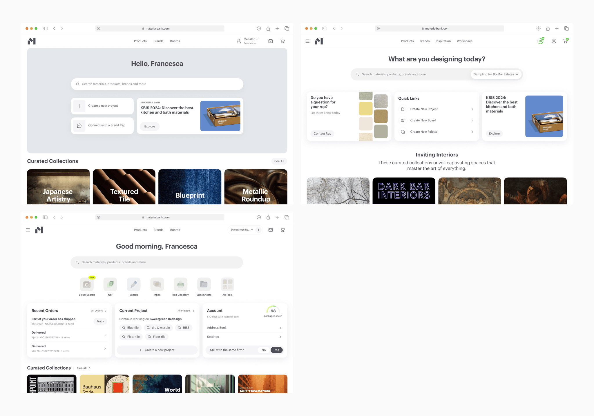
In just a few days, I explored different interface options across the product. It helped me understand it better and keep the experience consistent.
By the end of the first week, I started sharing screens with other designers, stakeholders, and team leads to get early feedback and make sure we were on the right track.
After a few quick rounds of changes, the concept started to come together—and it was time for a crash test.

At this point, I had to make sure the new design worked for real users, and supported our business goals.
So a design team and I met with leaders from different teams—merch, sales, logistics, support, and sustainability. We asked each of them similar questions about their goals:
Who are the users, and what problems do they have?
What ideas do you have, and why?
What do you focus on day to day?
What metrics matter most to you?
What makes it hard to contribute to the product?
How can we improve the product for your team?
How might this redesign help your area?

By the end of the first month, I had aligned the redesign concept with the team and gathered a ton of insights from users and stakeholders. These helped me refine our approach. Here are a few key takeaways:
Overall, the feedback was good. Stakeholders liked the concept, and users had no issues with the main flow.
Most users saw Material Bank as just a material store, so they were pleasantly surprised by the toolbox in the prototype.
The biggest problem was the checkout—many users didn’t notice some items were out of stock and wouldn’t ship overnight.
The catalog felt small, not because we lacked materials, but because the filters were confusing.
"Projects" felt optional to users—they didn’t really get why they mattered.

Once the new UI concept started to come together, I built the first component library in Figma. That library grew into a full design system, which made it easier for all teams to work on the product.
Historically, Material Bank's mobile audience share is 1.5%. Therefore, the site was not optimized for mobile devices.
In the new version, we also didn't want to spend time optimizing the mobile experience, but on the other hand we saw great opportunities for cross-platform interaction in the future. We decided to keep the desktop-first approach, but add adaptability at the component level.


Before launch, we always test new features to make sure everything works well. After finishing the design, we shared it inside the company for feedback. We also let our top 10 partner design firms try a closed beta and tracked how it performed.
Surprisingly, our main metrics didn’t drop—something that usually happens with big redesigns. It's even went up. That was great to see, but the best part was how much customers liked the new experience.

hi@alan.works